Designing ‘Better Price Alerts’

One year ago, we launched MySmartPrice Chrome extension that would help users discover the lowest price of the products sold online. The idea was to notify users of a better price (if available).
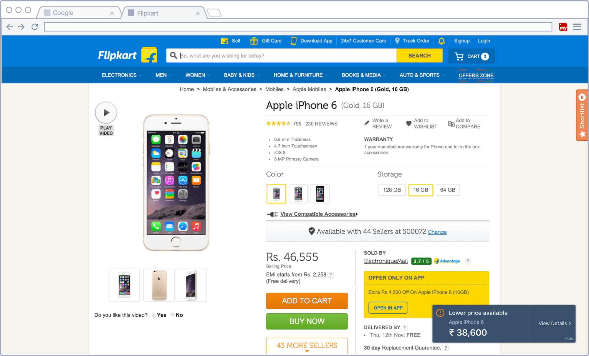
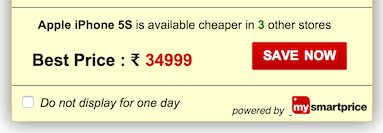
A pop-up would appear on product pages which simply contained the better price of that product. Clicking on the “Save Now” button would open a new window showing our product details page containing an extensive price-table.

Since Chrome extension opens up limitless opportunities for what you can do with every page visited in the browser, we confined ourselves within certain (read moral) boundaries. One was not to interfere with the usual page elements. If a pop-up was to be displayed, it should look like a pop-up and not dupe users by looking like an element of the page.
Our pop-up did just that. It appeared on pages when a better price was available for the product on e-commerce stores. It stood out from rest of the page giving users a feeling that it was an external element, and not part of the page. However, despite the notification being useful, the click-rates were less than expected. This left us wondering if we could improve the click-rate through a better design.
Part I
We started with making the pop-up aesthetically pleasing. We tried various colour combinations and finally settled on a dark background (wet asphalt) with a light text (white) on it. This design decision served two purposes: first, it felt like it wasn’t a part of the page by standing out from the rest of the content and second it made its presence felt without being too “catchy”. We also tried making it as unobtrusive as possible by reducing its size to a bare minimum.

With the help of CSS animations/transitions, we also tried to explain the changes in the arrangement of elements on the screen. The pop-up slides from right with and stops with a subtle bouncing effect. The idea was to guide users attention that would inform them of the new element.
Part II
In the following iteration, we made the copy more clear, and increased the visual affordance of the “View Details.” However, these changes did not affect much. We had to make more radical changes to measure the effect.

Part III
In our third iteration, we took inspiration from the design of notifications in Mac OS. We introduced two new elements — a warning icon and the product name in the pop-up. We believe, although the latter is just restatement, it helped create a better context of the pop-up. We also sacrificed our logo for the simplicity.

Subtle animation was turned into a more prominent one — slide and bounce, — but only to a limit where it did not feel obtrusive.
Our lead, Rohit, suggested another improvement and the overall user experience went up a notch. While scrolling the page, the opacity of the pop-up is slightly decreased, and when the user stops scrolling, the opacity goes back to normal.
It gave users a sense of what was going to be hidden behind the element (although it was quite small), and it made its presence felt, repeatedly yet in a subtle manner.
To provide a more native experience, we used the default operating system typefaces, i.e., San Francisco Text/Display, Helvetica or Segoe UI.
All these experiments so far have lead us to double the click rate on both page and user levels.
Things Learnt
Suss out the objectives of the project beforehand and have answers to fundamental questions like what are we trying to do and who are we building it for. Also, people do care about things that are visually appealing (at least in this case they did). Instead of experimenting with the core content of the notification, we simply restructured it.
This is yet another work in progress at MySmartPrice.com. Do let us know in the comments how we can help you shop smarter. Please stay tuned for more updates.
Take our free Chrome extension for a spin and save more!
